|
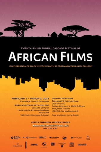
The off centred black silhouette keep the poster looking balanced. The first thing I look at in the poster is the bold white text that reads "African Films" The way the village contrasts with the city scene keeps me intrigued in what the meaning of the poster could be but doesn't take away from the heading "African Films" The colour palette they have used work very well together and create a relaxing and calming feeling. I also have noticed the colours are slightly gradient becoming paler towards the black. This puts more emphasis on the heading of the poster and draws your eyes to the title. I think if the colour palette in this poster were to change it would take away from the cultured look. If it were blue and purple it would appear as more of a sunset rather then the African desert and the same meaning wouldn't be shown through the poster.
|
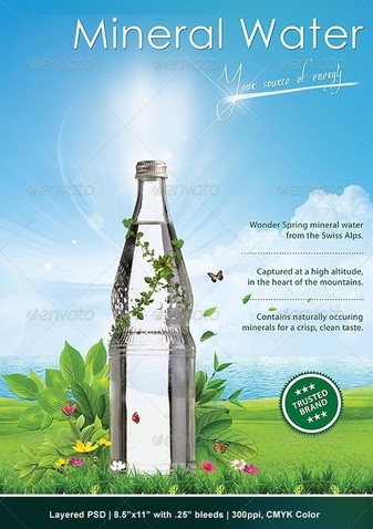
I chose this poster because I hadn't seen many others like this. The use of light in the picture thats shining behind the bottle gives the bottle more importance. The contrast of the green against the sunlight gives the poster a very clean natural look and with the ocean in the background the poster looks very refreshing. This is good because it associates the clean and refreshing feeling with the water making you want to buy it more. I think the vines wrapped around the bottle is a main feature in the poster and stands out a lot. It gives the affect of the bottle being a part of the nature as if its connected to it. This is also portrayed thought the butterflies surrounding the bottom of the bottle. I like the way they have used two fonts that are complete opposites because it gives the poster balance and makes the poster more eye catching.

The colour palette in this poster isn't coherent and clashes with each other. I find that this poster doesn't have a focal point making it hard to look at one place for long enough to read it. The slightly patterned background just adds a very messy look to the already busy texts thats on top and makes it hard focus on anything. I think too many different types of fonts and sizes were used and too much text was squeezed in the poster making it look careless and cheap.
